It’s interesting to think of The Clock as an anti-movie, not only because of its extensive format but also for its ‘anti-entertaining’ qualities.
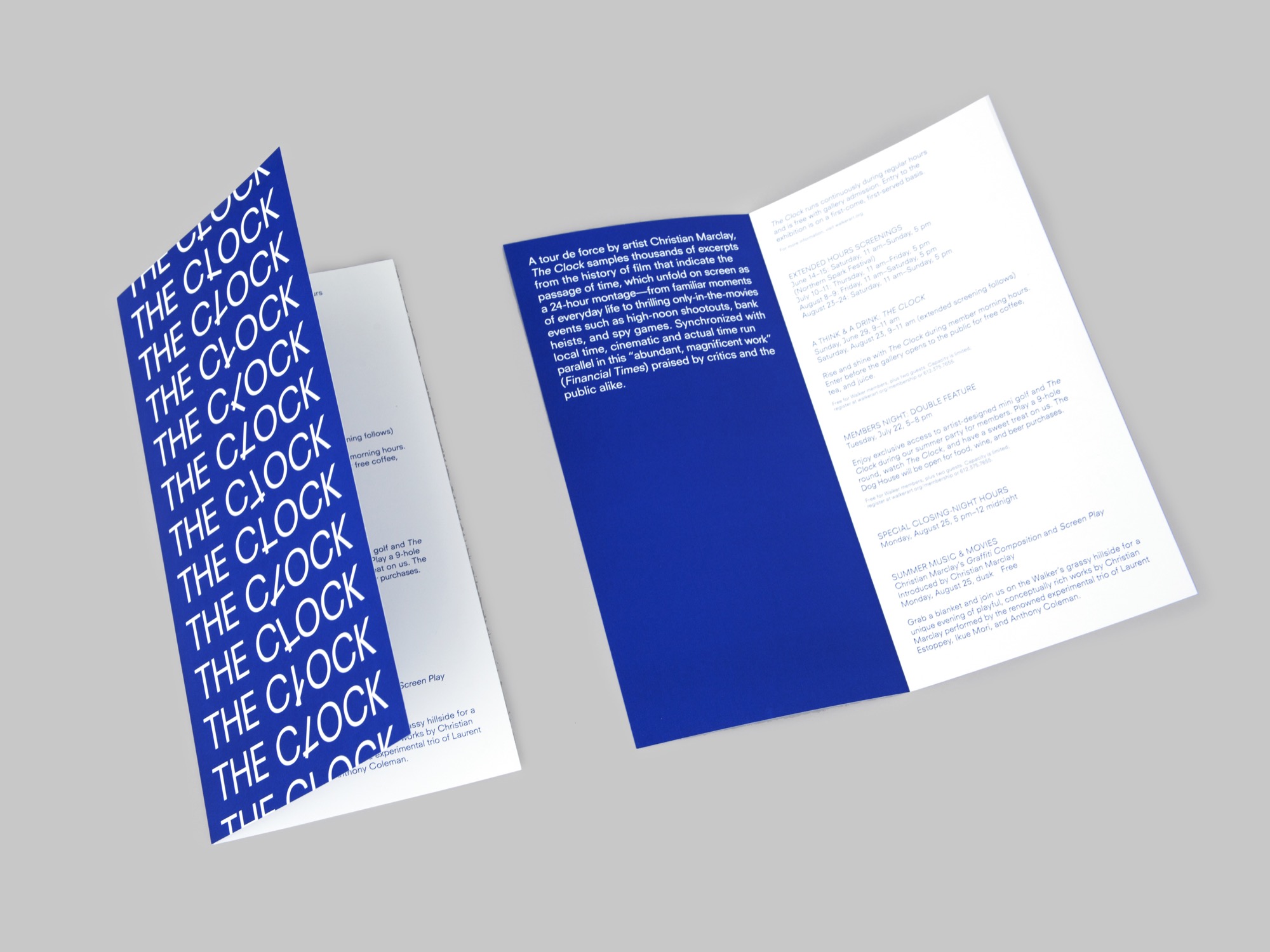
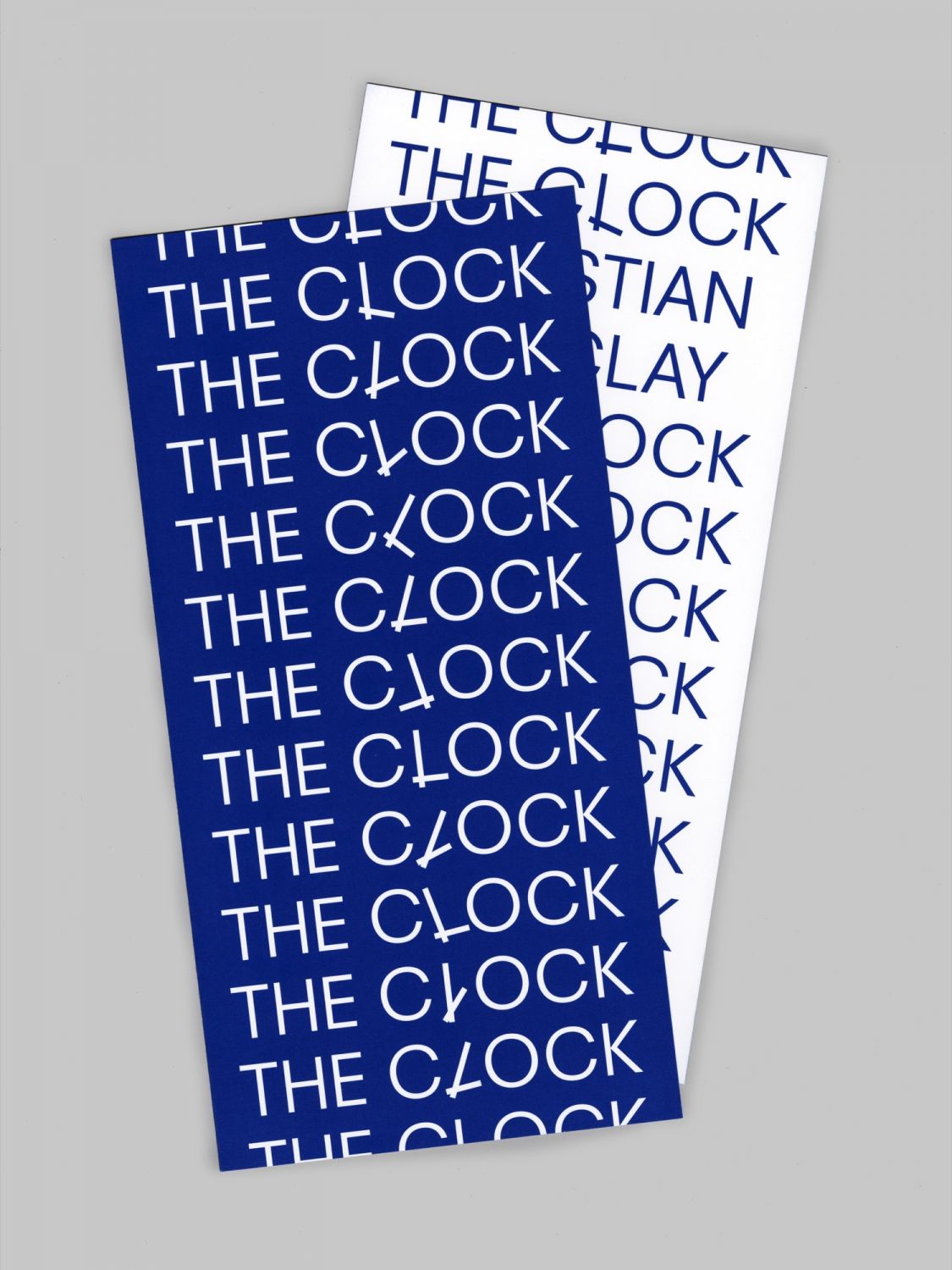
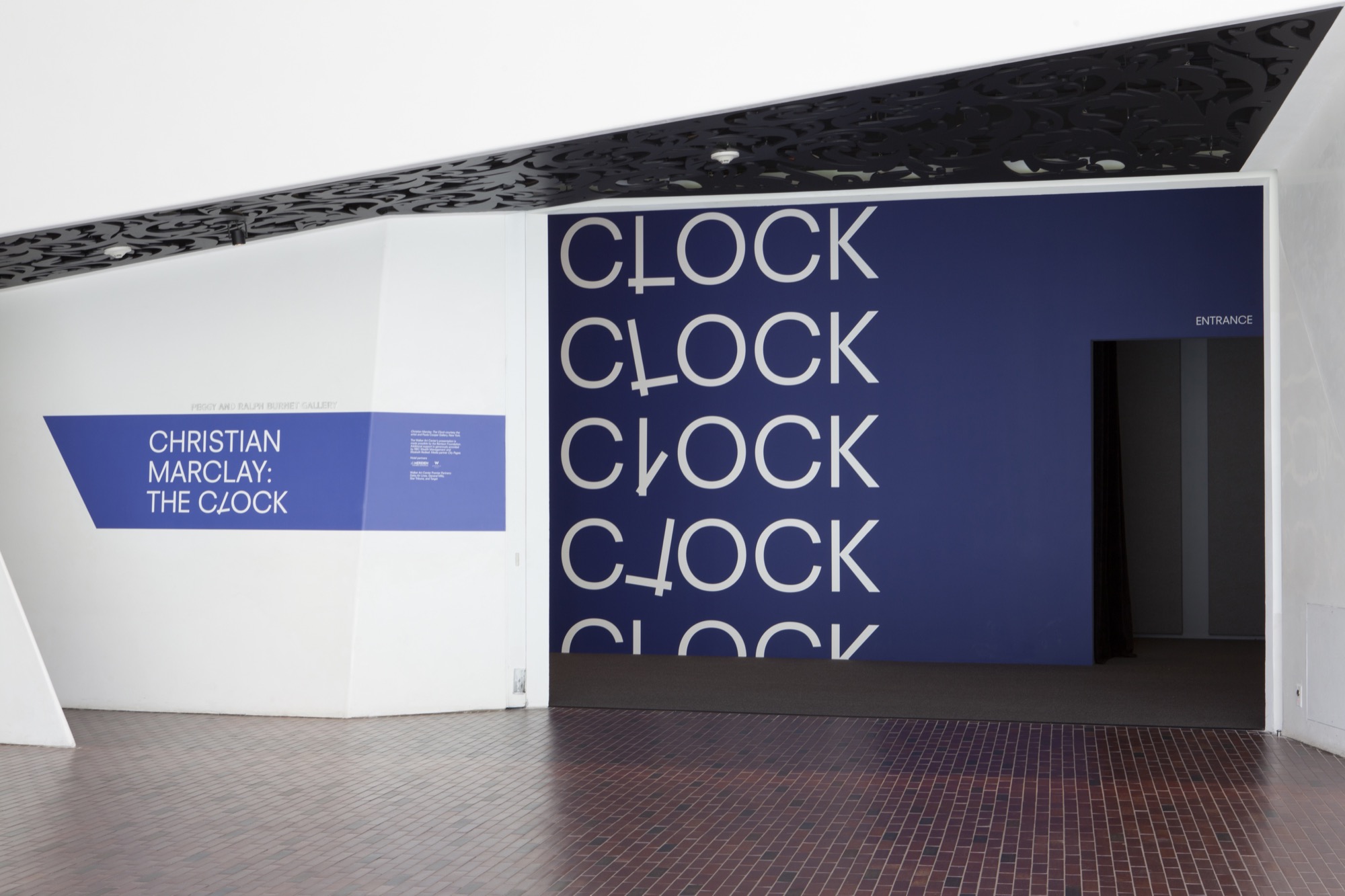
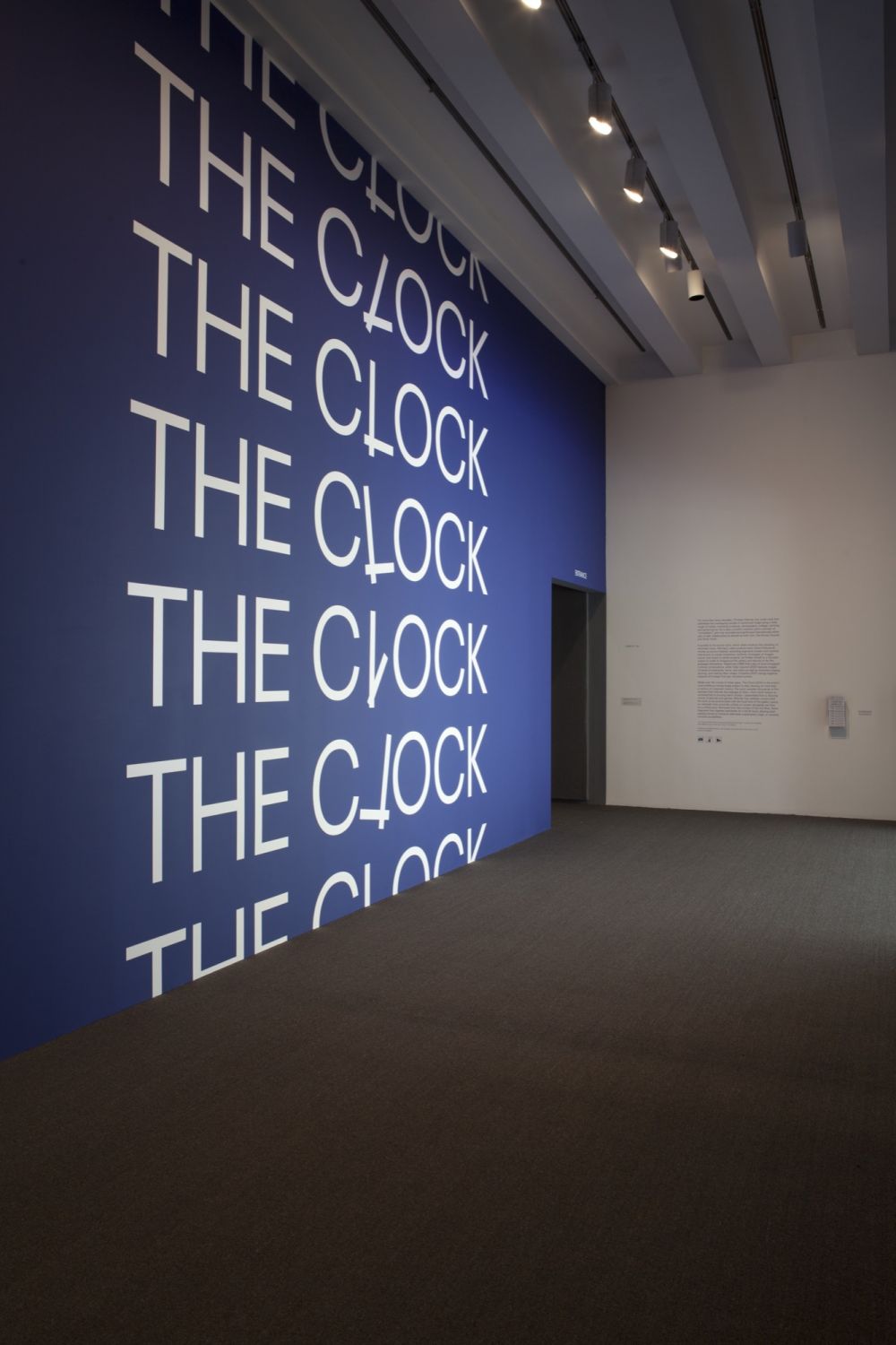
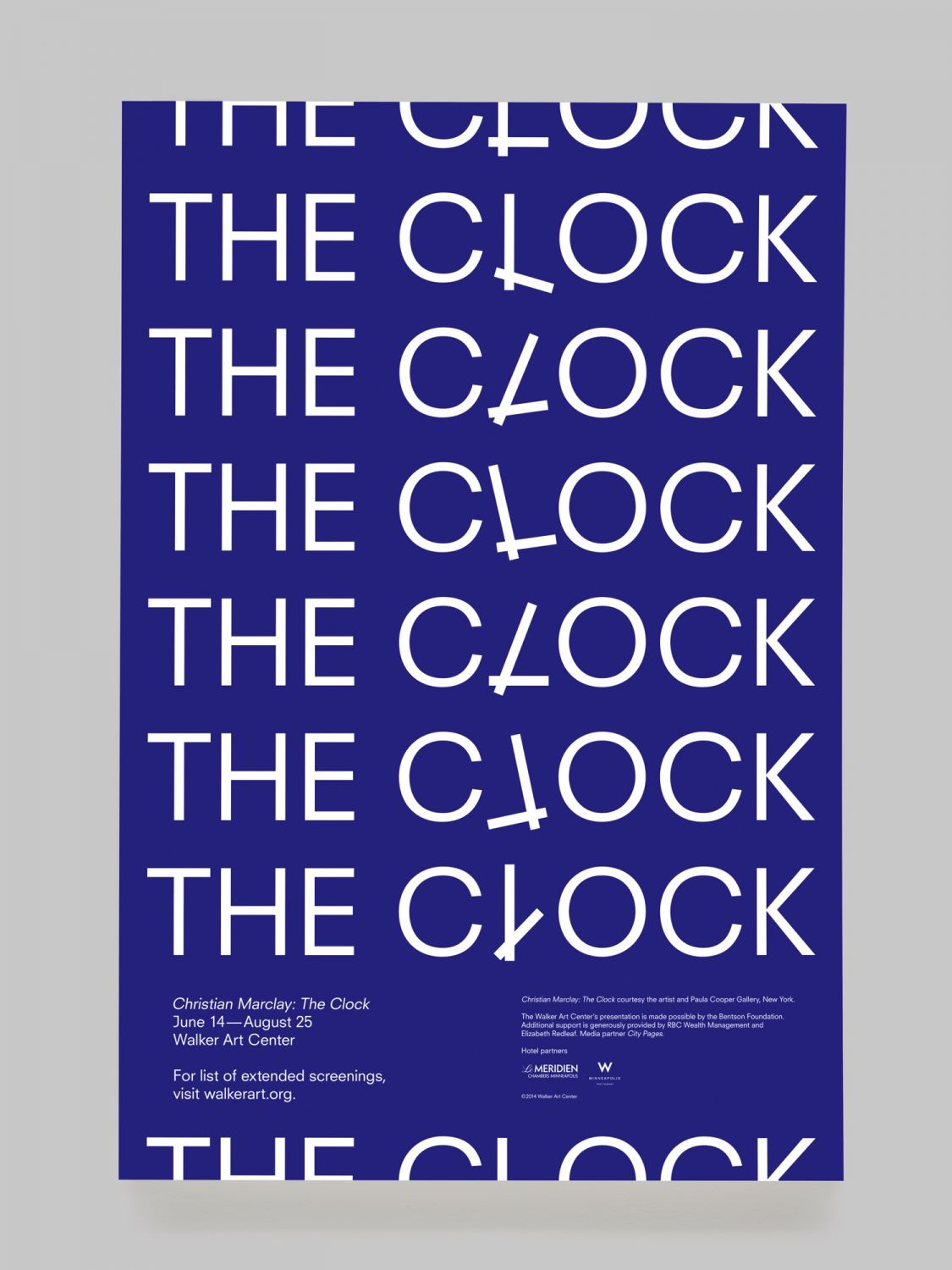
For numerous reasons, the available film stills were not satisfying and developing a typographic approach seemed the best option. Using the ‘L’, the central letter of the words ‘the’ and ‘clock’ put together, became an obvious solution. The two words merge into one single ‘image’, embedding the dynamic system in itself, as would be the title of Marclay’s artwork being at the same time the modest name and the ‘container’ of the concept for this 24-hour movie.
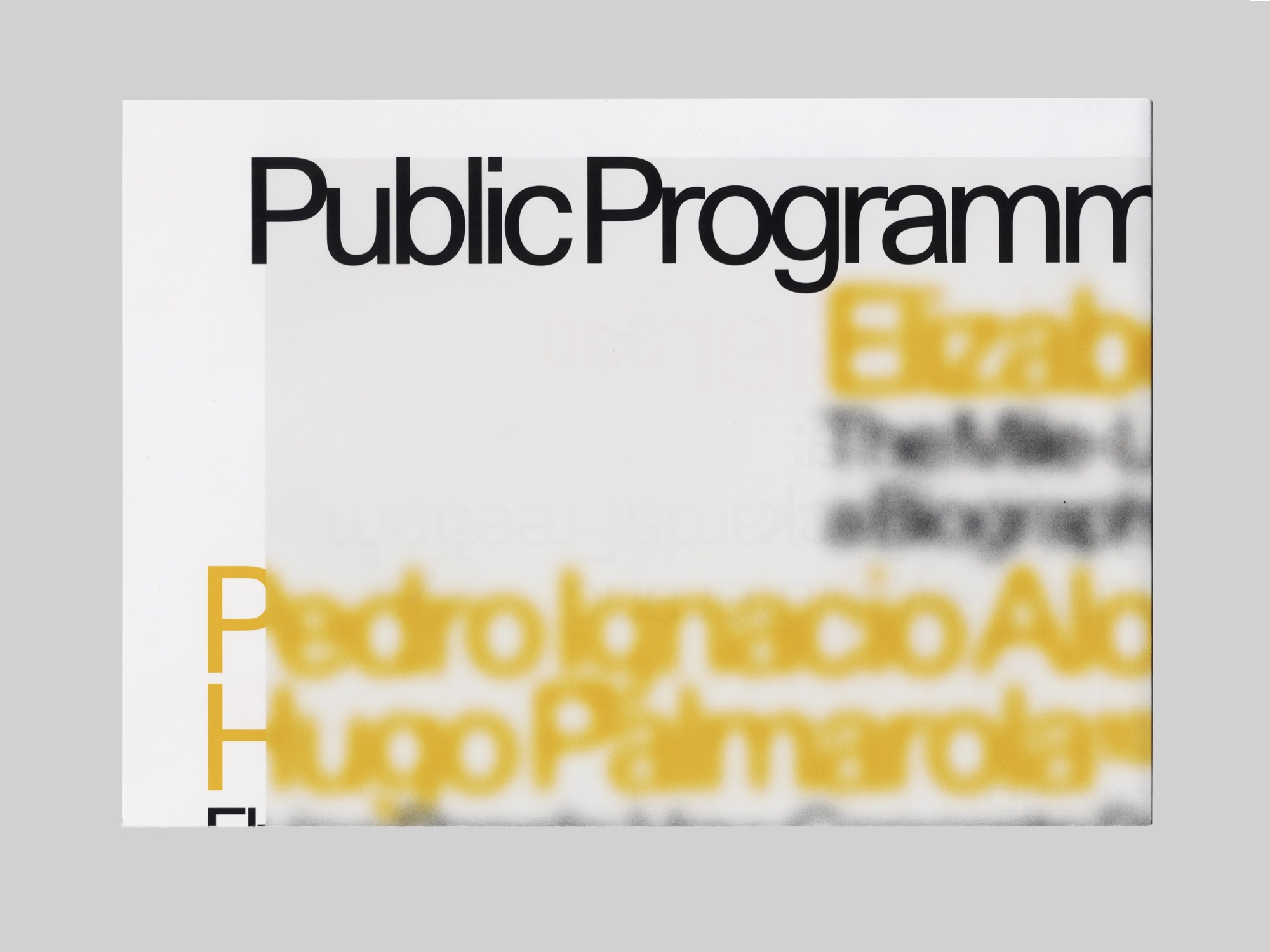
This graphic system was to be deployed on an oversized invitation (referencing Marclay’s earlier work with vinyl and music) and information cards, a poster, a title wall, and a few other collateral applications such as badges.
Read more about the process here.
For the Walker Art Center, Minneapolis
Exhibition identity, poster, invitation, gallery wall, other
Various formats, 2014
